Luxury Living at Montague Square
Development: Montague Square
Property Manager: Melbourne Real Estate
Montague Square is South Melbourne’s first purposely-built residential tower, designed by Rothe Lowman Architects, constructed exclusively to provide rental accommodation for those seeking a new way of living. All apartments have been designed with the occupant in mind to enable exceptional living in an environment that provides for long-term occupancy in a modern urban community.
Our Involvement
Earlier in 2021, MORC Interiors was asked to furnish two display suites and a luxury apartment for Melbourne’s newest “build to rent” model situated in South Melbourne. This case study is about the luxury apartment fit out.
Our role here was to design a luxury apartment on the 17th floor for a family of four. The family live interstate but travel to Melbourne all the time for work and leisure. This beautiful apartment is the family’s residence and holiday home when they come to visit.
Planning
We visited the site earlier in the year, when it was still a construction site. We put on our hard hats and high-vis shirts and were escorted up to the top of the building to view this stunning apartment.
The apartment itself has modern, grey tiles throughout with carpeted bedrooms. The benefit of tiles means that they are hard wearing and resistant to scratching over time. But the disadvantage is that they can feel quite cold. With this in mind, the first priority for us was to warm it up and provide a layer of cosy textures to make the space feel more welcoming.
The walls were crisp white, making it easy for us to bring in our own colours and textures. The fixtures within the kitchen and bathrooms were a beautiful warm oak with powder coated black metal hardware. The black hardware echoed beautifully against the black framed windows and is the reason why we continued this theme throughout with our furnishing and styling.
Overall, the space has beautiful light coming in from the floor to ceiling windows, with half of the rooms boasting more than one view towards the cityscape of Melbourne. This gorgeous apartment was completed during our hardest lockdown yet, but the show still went on!
Floor Plan

Mood board
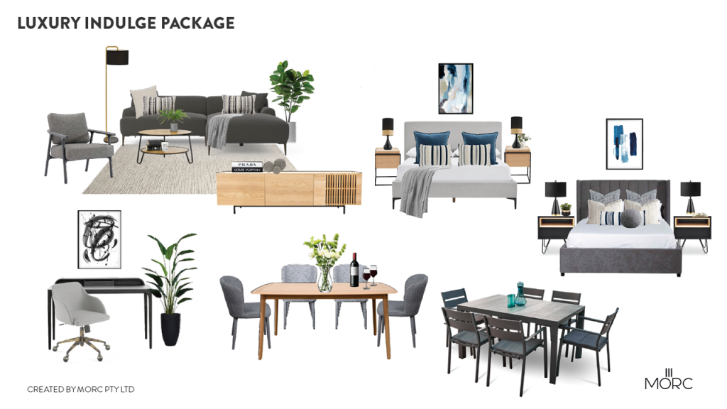
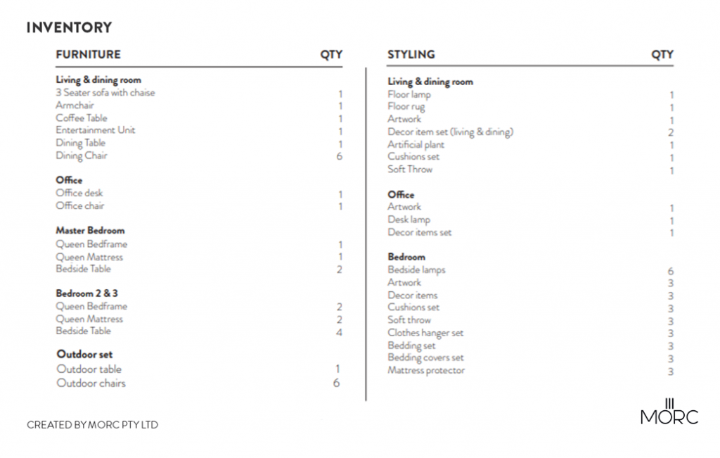
Inventory List
Design Process
Living Room
The first thing our designer chose for this space was the sofa and armchair. Being a family of four, a three seater didn’t quite cut it so she chose a chaise sofa plus an armchair that would perfectly fit within this space. Charcoal was the choice of colour for easy maintenance and to stand out from the lighter floor below. The thick woven textures within the sofa material provide a layer of texture that feels warm and inviting against the cold tiles. The sofa and chair stand proud off the floor on slim legs, to prevent the space from feeling too enclosed and tight.
Going dark on the sofa, meant we could lighten it up again with the cushions and throw. A neutral palette sets the tone for the open plan living space, so that the eye can travel outside the windows, absorbing the breathtaking views from outside. The warm woolen throw strategically placed across the chaise, oozes with comfort and warmth – another trick to offset the cold from the tiles.
The artwork hanging above is simple, but effective at creating interest at eye height as well. It’s important to decorate different heights within a space to allow your eye to travel equally around a room. The same goes for the interesting floor lamp, hosting two small plants on its marble shelves.
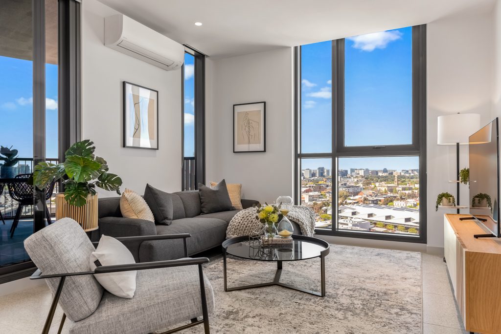
A glass coffee table was chosen to keep the space feeling light and open. It’s black frame echo’s the architectural fixtures along with small elements within the other pieces of furniture such as the legs of the TV unit. The oak tv unit is the only pop of warm timber in this space, but is enough to carry consistency from here to the kitchen cabinets.
The large rug ties the living space together, provides a sense of warmth, adds another layer of texture and separates it from the dining room. All of the greys within this rug unify the multiple shades of grey throughout the living space.
The styling is quite simple but bold, using flecks of gold, glass and greenery throughout.
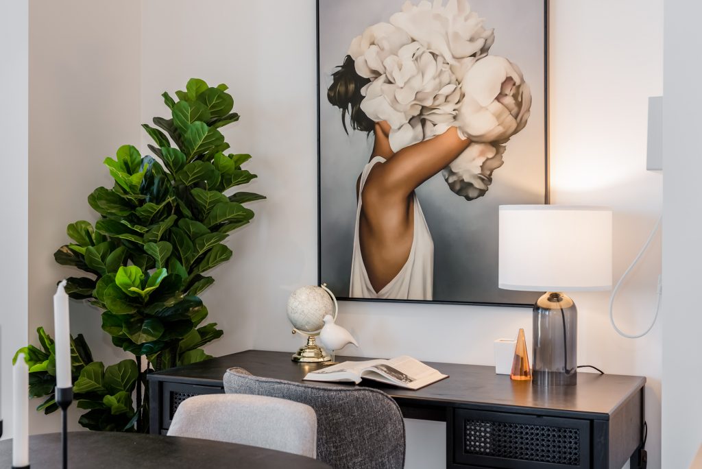
Dining & Office Nook
Our family of four, can fit two more guests onto their dinner table with this stunning black oak table with a sleek frame. The black table stands strong against the floor tile below, which meant we could avoid using a rug beneath it. Rugs beneath dining tables are not for everyone as they can be high maintenance.
To prevent the black table from feeling too heavy, we went for light grey, fully upholstered chairs (even the legs) with an opening on the back. This opening is a very important feature here as it keeps the setting feeling more open and light.
The dining table is right beside the built in study nook so consistency was key. Another reference to black appears in the desk with an introduction to a textured rattan finish on the drawers. We chose an office chair without wheels so that it could double up as a spare occasional chair if the family have more than themselves over for an evening.
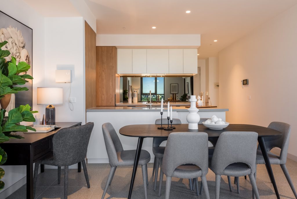
This nook provided us with the perfect spot to hang an oversized piece of art to create drama in this section. But why stop there? We went for an incredibly full, fiddle leaf plant to create volume in the nook and provide some vertical detail to look at.
The styling pieces on the dining table and desk are what really bring the space to life. More greenery, glass and gold fill the surfaces providing personal touches to the space.
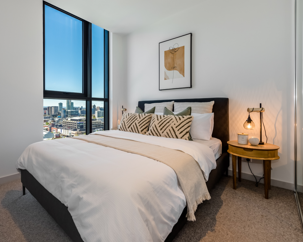
Bedroom One
This bedroom was designed for our clients youngest child and was kept fairly light and bright due to it being a bit smaller than the others. The more light you have in a space, the bigger it will seem. We wanted the space to feel cosy and relaxing rather than cramped and busy.
The queen bed is lifted up on tall, oak legs to help it feel less solid within the room. The Grey fabric bedhead was the perfect backdrop to the beige, white and sage green colour concept on top of the crisp white linen. Fresh white linen always helps a small room feel bigger and brighter as it reflects light beautifully. The textural cushions paired with the neat, natural throw take the glare off the white linen.
Oak bedsides continue the wooden theme from the living area and stand tall on slim legs making the room feel more open. Even the bedside lamps were carefully chosen to feel a bit more delicate and petite within this space.
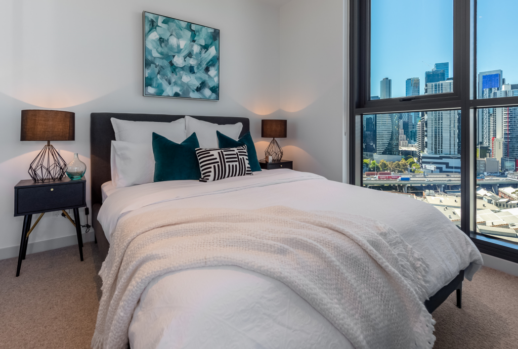
Bedroom Two
This bedroom was designed for a teenage boy without being overly masculine. From this room, we see a lot of blues and greens in the glass of the cityscape outside, and we wanted to reflect those colours in here. The art was chosen with that in mind and sets the colour palette for this room.
Our designer pulled the teal colour out of this painting and brought it through the velvet cushions and small décor items on the bedside table. A striking, geometric pattern was added to the front cushion which connects the eye to the similar detailing on the lamps. The lamps are big and grand, yet open and light for this space.
We repeated the black furniture theme in here which continues into the living area. Thanks to these magnificent windows bringing in incredible amounts of natural light, this small room could tolerate darker furniture.
The small flecks of gold happening in the bedside add a touch of lux and maturity to this space and remains consistent with the metallics used throughout the apartment.
Master Bedroom
And finally, this is the master bedroom. The first thing our designer noticed about this room was that the Air Conditioner was on the wall where the bed would sit. This left no room for a piece of art to go over the bedhead. But this is the master bedroom and art was non-negotiable for our designer. It needed to feel grand and lux for our busy professional clients. With that in mind, the plan was to steer the eye away from the AC unit, by placing heavier detail and drama down low and wide.
Our designer chose this beautiful, extra wide, velvet bedhead which feels grand without being tall. Losing 20cm of height in the bedhead, allowed for this beautiful framed canvas to be hung in landscape direction.
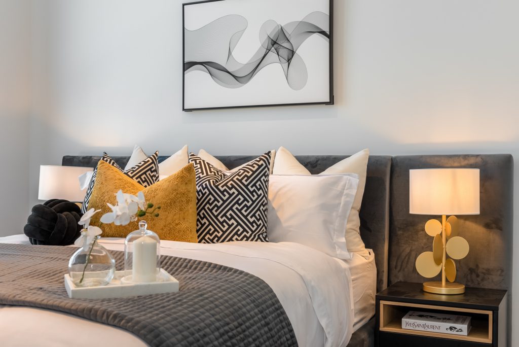
To create visual weight, volume and drama on the bed, 3 x euro pillows were added to the queen bed instead of two. They are followed by geometric pattern cushions which are eye-catching and allow the gold mustard cushion in front to pop. The black knot is just the cherry on top for drawing the eye towards the bed styling, and not the AC.
The two toned bedsides were perfect for this bedroom. They echo the black and oak finishes happening throughout the apartment, and are the perfect scale for the wide bedhead. The styling here was kept very simple to allow the quirky and unique lamps to shine! How cool are they?!
Check out this Virtual Tour
Conclusion
We hope you enjoyed our walkthrough of the Montague Square Luxury apartment. If you want to find out any more information about this development, or if you have any questions for our designer, don’t hesitate to reach out to us. If you have an apartment needing furnishing, make sure to think of MORC Interiors for your furnishing needs.
Let Us Help!
If you are looking to furnish and style your investment property that is focused on achieving the results you want, contact us so that we can help you out.
Enquire Now