How to Make Your Small Space Feel Larger
Today, tiny homes, apartment living and downsizing have become very popular trends as more and more people attempt to live a simpler life. Besides being trendy, a smaller home may be a requirement for people who struggle to get onto the property ladder. There are plenty of benefits to a smaller home such as reduced clutter, affordability, less running costs, minimal gardening, less furnishing costs and it can feel more cosy and homely. But a small home can quickly become claustrophobic if it is over-decorated.
Here are some useful tips on how to make your small space feel larger.
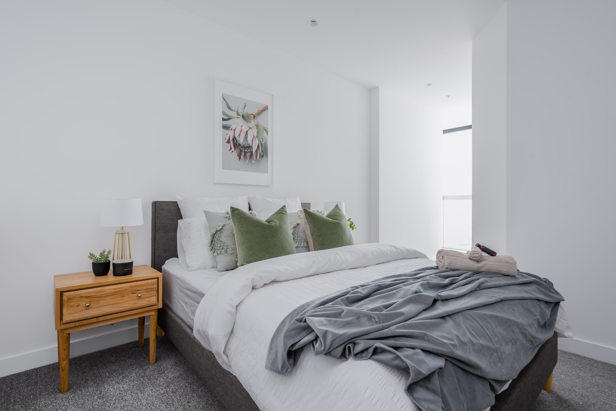 West Side Place, MORC Interiors
1. Low lying furniture with tall elements will draw the eye up.
This point might sound a little contradictory at first, but hear us out…With your main furniture such as sofa, armchair, dining chairs, bed etc., try to keep them low-lying. The idea here is that you walk into a room and can comfortably see past the ‘obstacles” to the furthest point.
While you are keeping your furniture low-lying, consider adding taller bookshelves that go from floor to ceiling. Another idea is to add kitchen cupboards that extend to the ceiling to create the illusion of more height. You could also consider tall artwork or a vertical gallery wall to draw the eye upwards. Drawing the eye upwards will give the illusion of a taller room and thus more space.
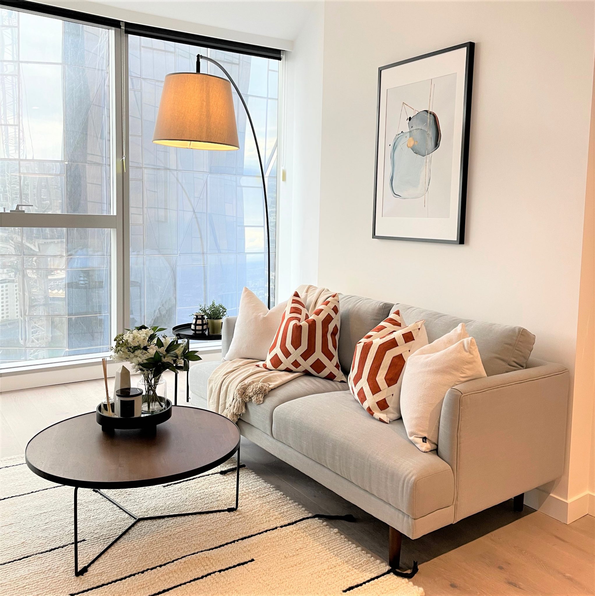 West Side Place, MORC Interiors
2. Light and bright colour palette.
When we say “Light and Bright”, picture “Three Birds Renovations”. They are the masters at creating beautiful, bright spaces! As soon as an old home gets painted white, it suddenly looks fresh, welcoming and BIGGER. Lighter colours will reflect natural lighting making it feel much larger. On the other hand, darker colours will absorb light making it feel smaller but more intimate.
Consider Whites, Creams, Soft Grey’s and Beige for your neutrals with pastel tones for accent colours (if desired). Avoid strong feature walls as this can interrupt the flow of your space making it feel smaller. And opt for a slightly glossy paint on the walls to reflect light, unlike a matt finish.
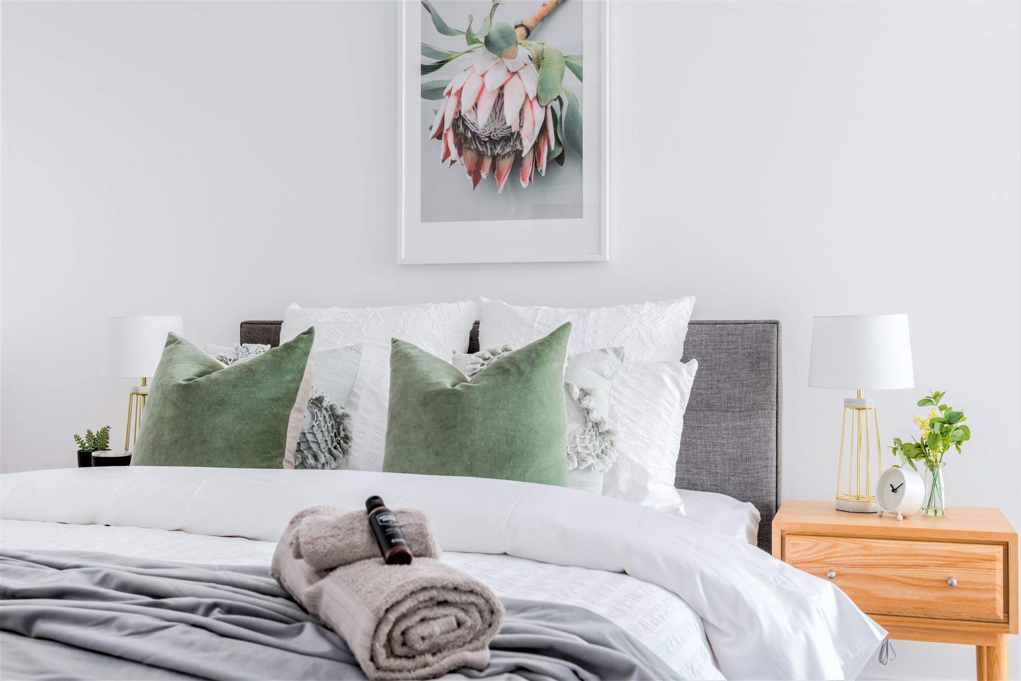 West Side Place, MORC Interiors
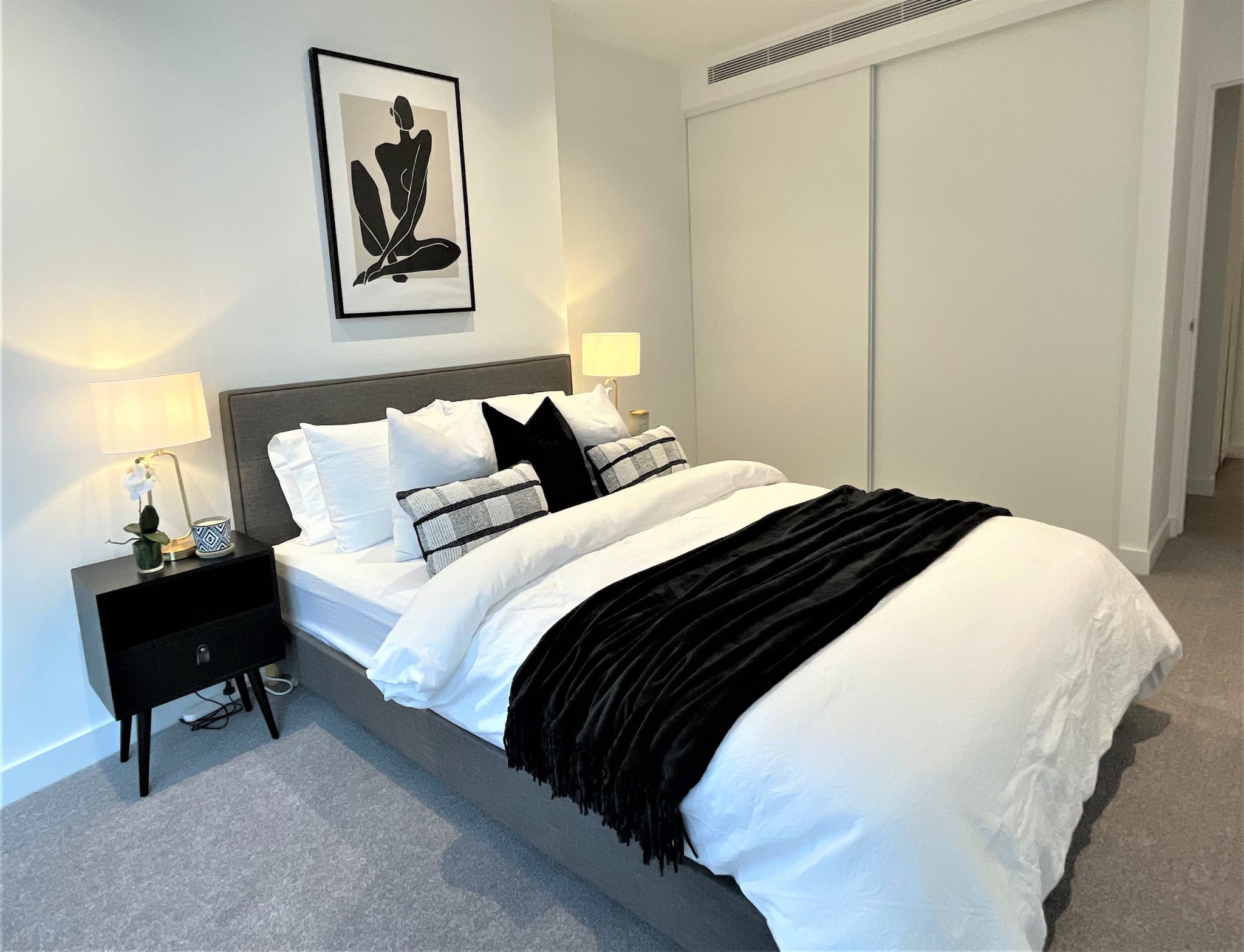
3. Keep it simple – ditch the clutter.
If you live in a smaller home, you may need to part with your ‘bits and bobs’ or at least hide them! Negative space is extremely important in Interior Design, Graphic Design and every kind of Design! Our eyes needs a visual break, to take in what they are looking at. It’s simple; the more free space you have, the more space you have.
Get rid of the things you don’t use anymore. If you haven’t used it within 1 year, throw it away! Do you really need to keep every book you’ve ever read? And why do you have magazines from 2012? Unnecessary junk (AKA hoarding) will make your room feel chaotic, cluttered and cramped.
 West Side Place, MORC Interiors
4. Use mirrors
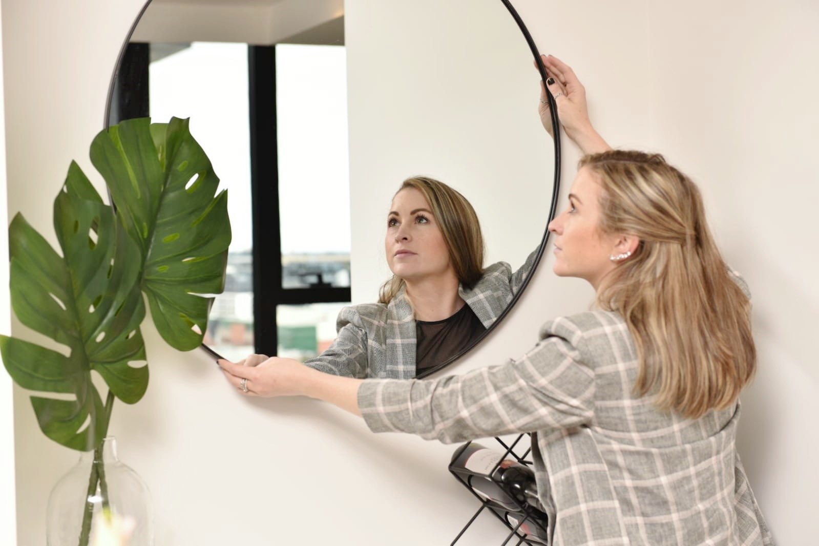
Mirrors are the greatest illusion when it comes to making a space feel much bigger than it truly is. For starters, they trick the eye into thinking there is more to the room or even another room behind the frame (depending on the angle you view it from). They are also brilliant at reflecting light, which we now know is the biggest key to making a room feel much bigger than it truly is.
To get the most lighting out of your mirrors, strategically place them facing or perpendicular to windows so that they can reflect the light around the room. You could be bold by hanging floor to ceiling mirrors in your room to provide the maximum amount of light and space illusions. Or, you could hang a piece above your fire, over a console or even lean a big one against the wall for a more modern look. Make sure to use an anti-tip mechanism though, or you will get seven years of bad luck if it smashes!
 Tracey Bright, MORC Interior’s Lead Interior Designer
5. Choose light furniture on tall legs
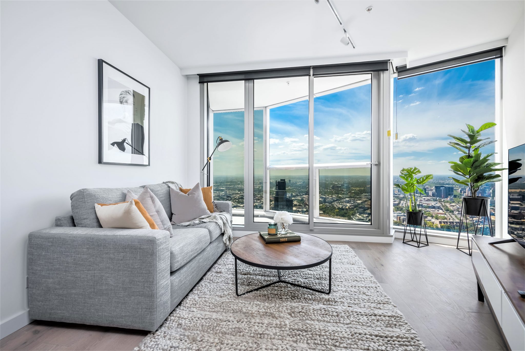
Now that you know the importance of light, let’s discuss the visual weight of the furniture you choose. It is important to strategically pick furniture that will feel less solid, chunky and boxed in. Heavy furniture can feel like an obstacle which we now know, we want to avoid (see point 3).
- Choose furniture that is on tall thin legs to create a sense of air flow.
- Go for bookcases that are backless, allowing us to see the wall behind.
- Choose furniture that has just enough storage to hide all the unwanted clutter lying around.
- Avoid furniture with strong patterns and thick fabric. A smooth fabric such as a velvet or linen will take up less visual space than a detailed weave.
 West Side Place, MORC Interiors
6. Create a sense of air flow by using glass
While mirrors reflect light, bright colours feel more open and delicate furniture feels less boxy, glass is a fantastic material to use to eliminate visual barriers. It is transparent, light can travel through it and it feels a lot lighter than other materials such as wood, marble and concrete. This means, wherever possible, you should consider glass.
- Go for a glass dining table as it is one of the biggest pieces of furniture in your home.
- Consider a glass coffee table to allow the eye to see the beautiful rug beneath.
- Choose glass bedside tables if you don’t mind losing some storage space.
- Select a glass shower door in the bathroom instead of a curtain or frosted glass
Heads up: with glass, comes a little more maintenance as you can see every fingerprint and dust sitting on top. A small price to pay for a big, bright, beautiful home!
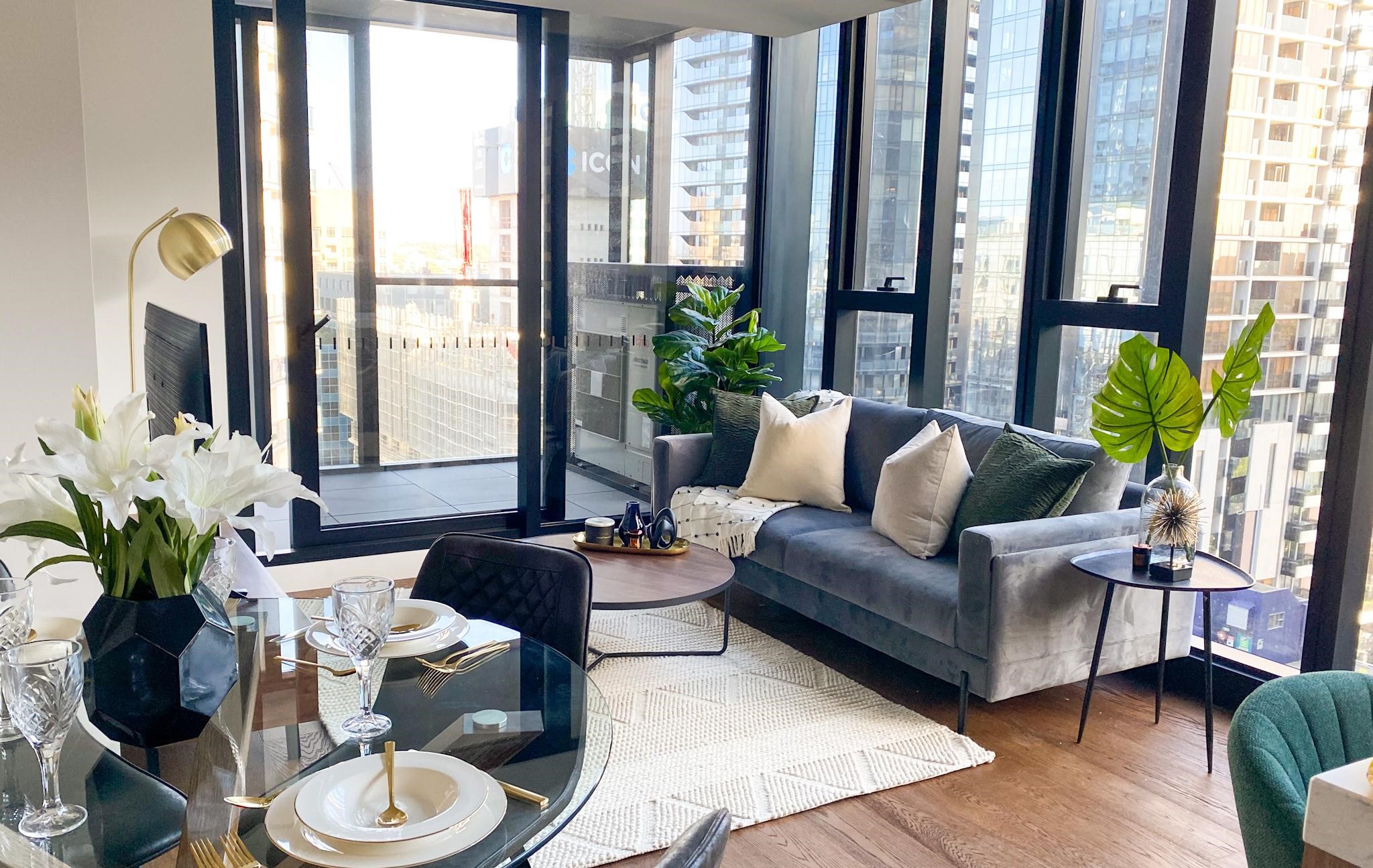 We used a glass dining table in this display suite to open up the space. MORC Interiors
7. Maximise Natural and artificial lighting
While we cannot make our rooms physically bigger (without a sledge hammer), we can certainly trick the mind into believing they are more spacious using light. Our eyes, see darker objects to be smaller than lighter objects. This is exactly why women love to wear black! If you increase the amount of natural lighting coming into your room, it will feel less confined and therefore bigger.
As well as focusing on your natural lighting, do consider your artificial lighting too. Create a layered lighting plan with a combination of ceiling lights, wall sconces, floor lamps and table lamps. We don’t want any dark corners that might shrink your space. Here are a few quick tips:
- Remove curtains and install blinds. Curtains are cosy and luxurious, but they eat into your room and can cover some of the natural lighting.
- Use multiple light sources, don’t just rely on one central one. The less dark corners, the better.
- Use backlighting in shelving units or behind mirrors to create the illusion of depth.
- Uplighting on walls is a great way to create vertical interest making the room feel taller than it truly is. The opposite (downlighting) can make a ceiling feel lower, so you don’t want to do this.
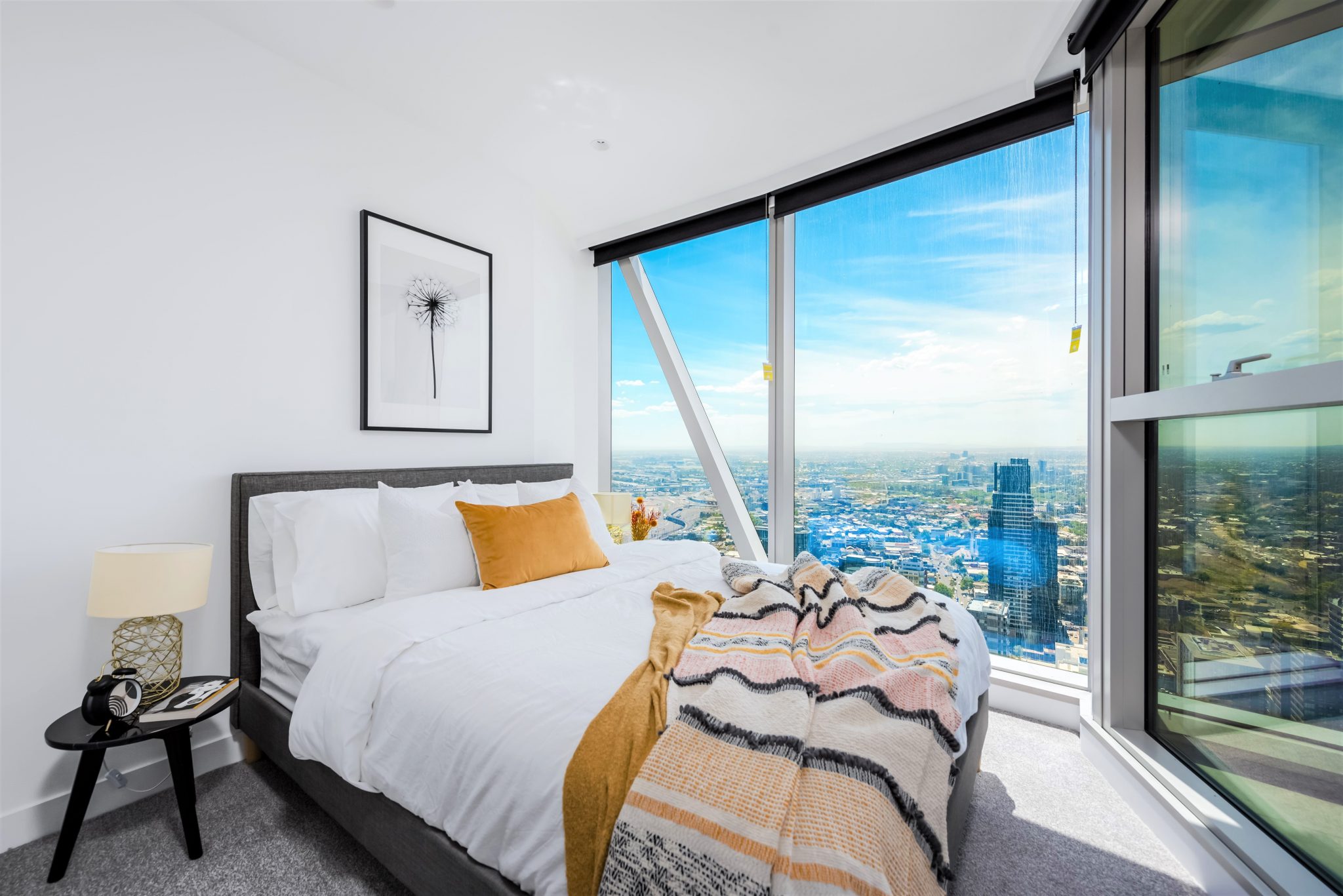 West Side Place, MORC Interiors
Check out this Virtual Tour of one of the properties we furnished and styled in West Side Place:
What did you learn from this blog?
We hope that you were able to take some practical learnings from this blog for your small home. Remember, big things often have small beginnings!
Please leave us a comment to let us know which point you liked the most or contact us HERE.
Let Us Help!
If you are looking to furnish and style your investment property that is focused on achieving the results you want, contact us so that we can help you out.
Enquire Now
Recent Posts
- 10 High-Impact Lessons that will Increase Rental Yield and Reduce Vacancy in CBD Properties
- Coastal Living Made Simple: Inside a Mt Martha Home Styled With Intention
- Bought at 380 Melbourne? Here’s How This Buyer Got a Fully Furnished, Move-in Ready Apartment in Just 7 Days
- Starting Afresh: Furnishing a Newly Renovated Home
- 5 Essential Tips for Home Office Comfort and Productivity