Luxury Skyscraper Living at Australia 108
The Location
Australia 108 is the tallest residential building in Australia. Boasting 100 floors of liveable apartments it towers over Melbourne, providing incredible 360-degree views of the city and beyond. Located in Southbank, it is close to the arts and entertainment precinct along with amazing restaurants and shopping hotspots.
Australia 108 is a visually stunning building complete with luxury finishes and considered interior design.
The Project
We were contacted by a small family who were currently living interstate. They had plans to move to Melbourne in the coming months and wanted their new apartment at Australia 108 to be fully furnished and ready to move-in upon their arrival.
Here at MORC that’s our specialty! We pride ourselves on being able to assist clients who are moving into a new home and who don’t have the time or means to do the work themselves. We immediately formed a strong relationship with this family and got to understand their requirements and style preferences for their home. Over a few emails and phone calls we had a tailored Design Proposal ready for them and it was up to us to then manage the procurement and seamless installation within a limited timeframe.
We were so excited when the client arrived in Melbourne and was wowed by what we had done for them. In this blog we’ll outline some of the design choices that were made and how we met the project brief to satisfy this client.
Mood board
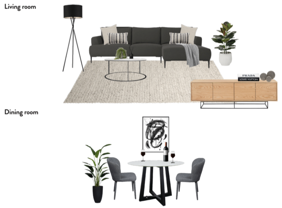
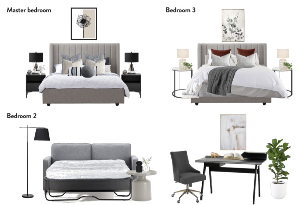
Inventory List
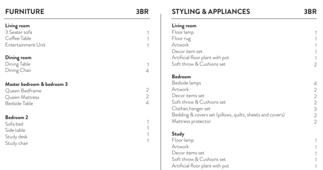
The Design Process
Open Plan Living
The most incredible part of this apartment is the views across Melbourne, so of course we wanted to highlight this and not detract from it. The sofa selection was very important to the client who wanted a chaise lounge for her family to be able to relax on, but still not take up too much space or impact the view. We selected a simple yet elegant sofa in a deep charcoal colour which pairs well with the surrounding materials of the benchtops and flooring. The sofa has a low back which means that we are still seeing as much of the view uninterrupted as possible, and it also has slim legs so that it is lifted off the floor and doesn’t feel too heavy in the space.
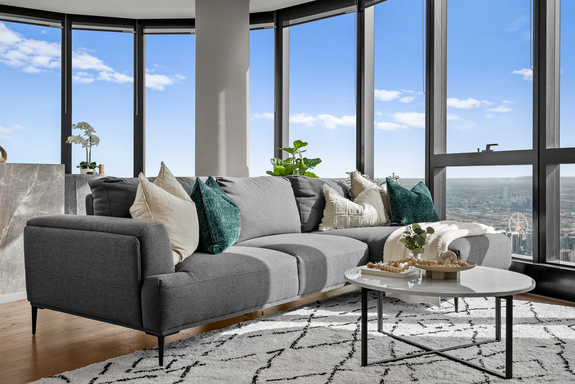
The client wanted simple styling to compliment our furniture choices in the living area and didn’t want the space to feel cluttered. We added some small décor pieces throughout which all tie together with the furniture and add a level of visual interest without feeling like too much.
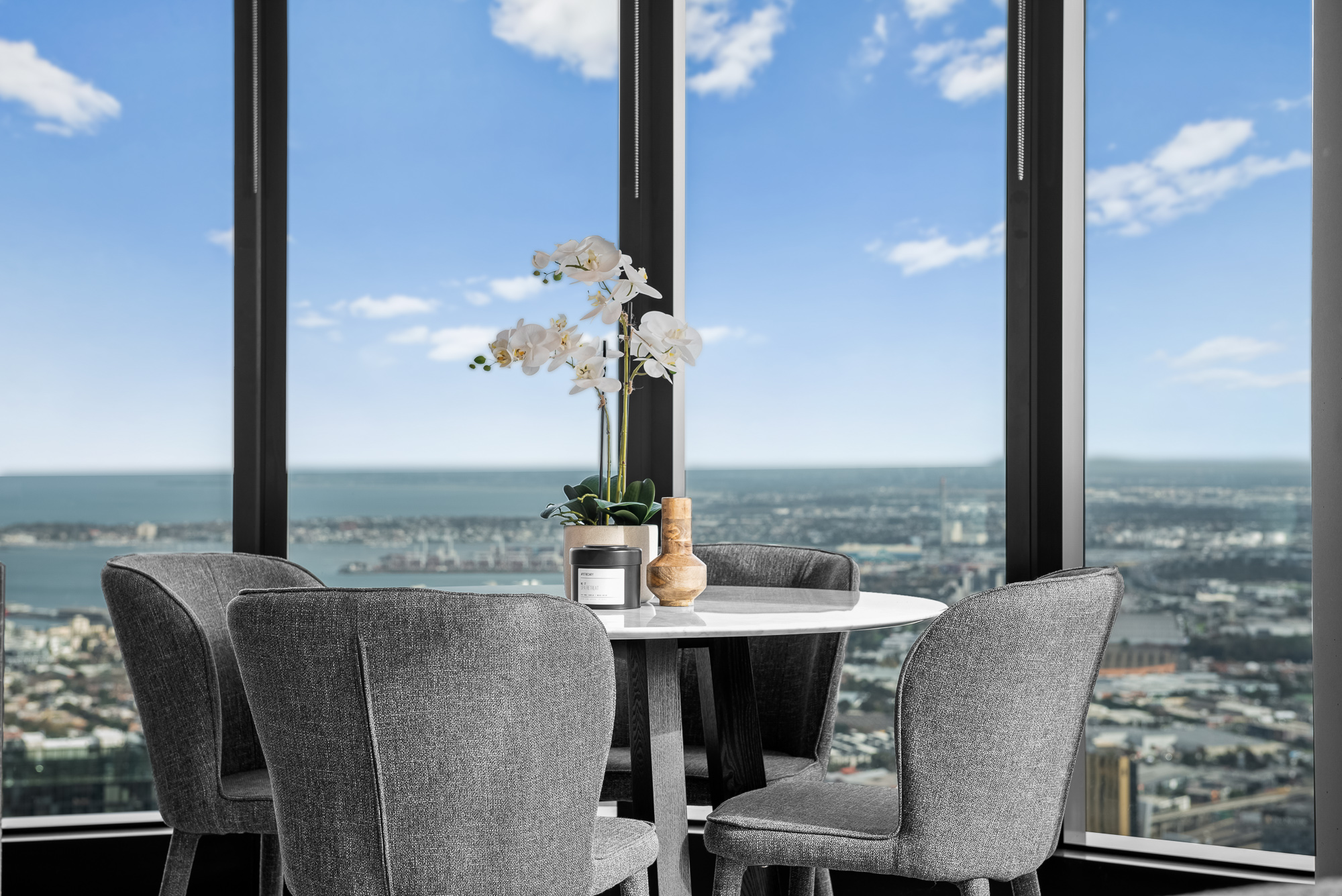
One difficult feature of this apartment was the large pillar in the middle of the living area which made selecting a dining table very crucial to get right. Due to the limited space we needed to ensure accurate measurements were taken and then chose a round 4-seater table, as a square or rectangle shape would not work. This was the perfect amount of seating for the client and the choices of materials in both the table and chairs felt very luxurious.
The Bedrooms
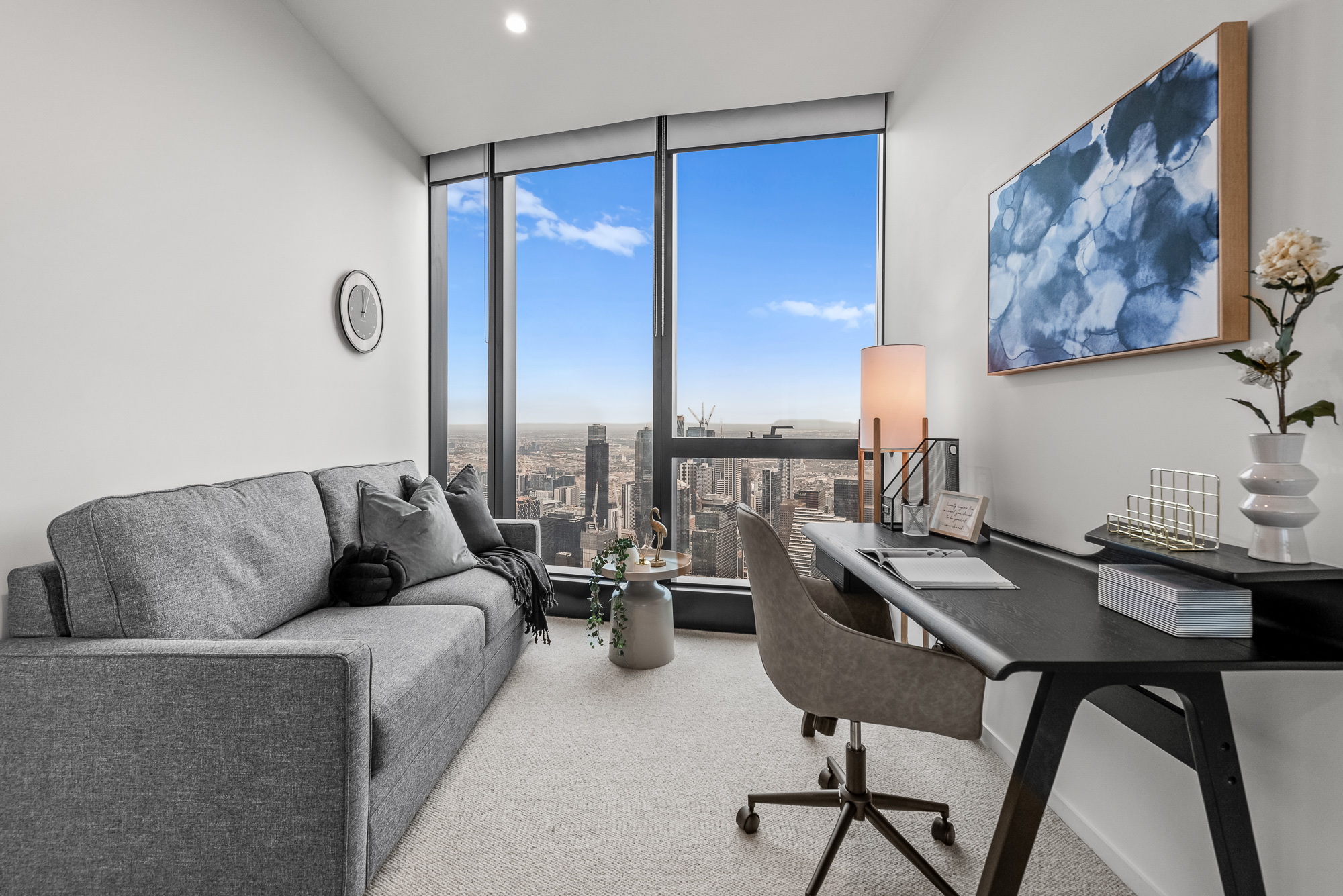
This apartment included 3 bedrooms all with great floor and wardrobe space. It was a request of the clients to make the smallest of the 3 rooms into a home office-come-guest room. Choosing a small room to be a multifunctional space can bring about some design challenges, so we needed to be careful when planning this room and take note of things like the location of power points.
To cater to the client’s needs of working from home almost daily, we included a small study desk and chair and then on the opposite wall we added a small sofa. This created an area that is cosy, inviting and is the perfect area to complete a hard day working from home. The bed also pulls out and transforms into a bed, ticking the box for an extra sleeping spot for guests.
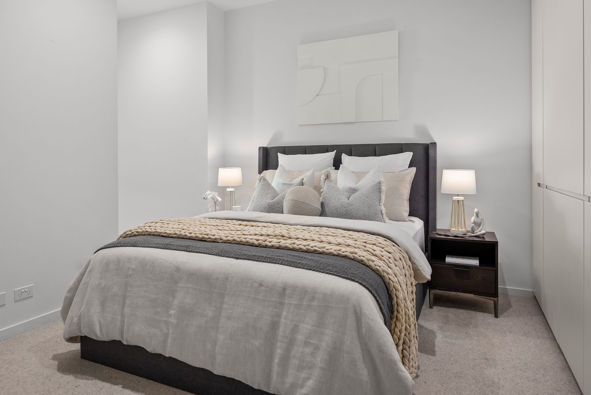
In the master bedroom the client wanted this to have a slightly hotel-luxury feel with a timeless design. The artwork we selected is a beautiful statement piece and although it’s a plain white colour the texture and design really make an impact. We layered up the bed with some elegant styling choices and the overall colour palette is calming and sophisticated.
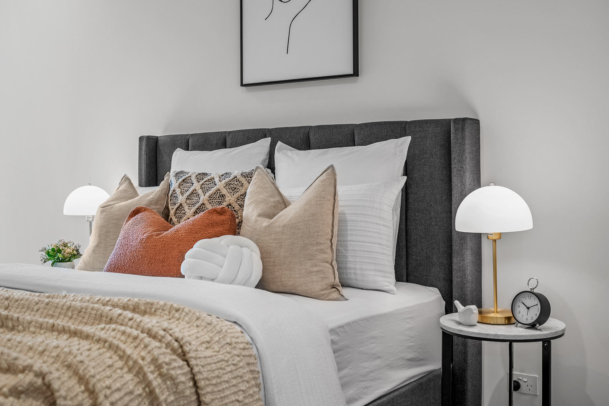
The second bedroom was designed for the daughter in mind who wanted the room to be quite neutral and versatile. We opted for simple artwork, bedding and lamps which together all make this space feel cohesive. The touches of gold within the décor still carries that hint of luxury through this space.
Let Us Help!
If you or anyone you know are in a similar position to this, then feel free to reach out to us today! We would love to be able to help provide you with a move-in ready home which is completely tailored to you.
Enquire Now
Recent Posts
- 10 High-Impact Lessons that will Increase Rental Yield and Reduce Vacancy in CBD Properties
- Coastal Living Made Simple: Inside a Mt Martha Home Styled With Intention
- Bought at 380 Melbourne? Here’s How This Buyer Got a Fully Furnished, Move-in Ready Apartment in Just 7 Days
- Starting Afresh: Furnishing a Newly Renovated Home
- 5 Essential Tips for Home Office Comfort and Productivity