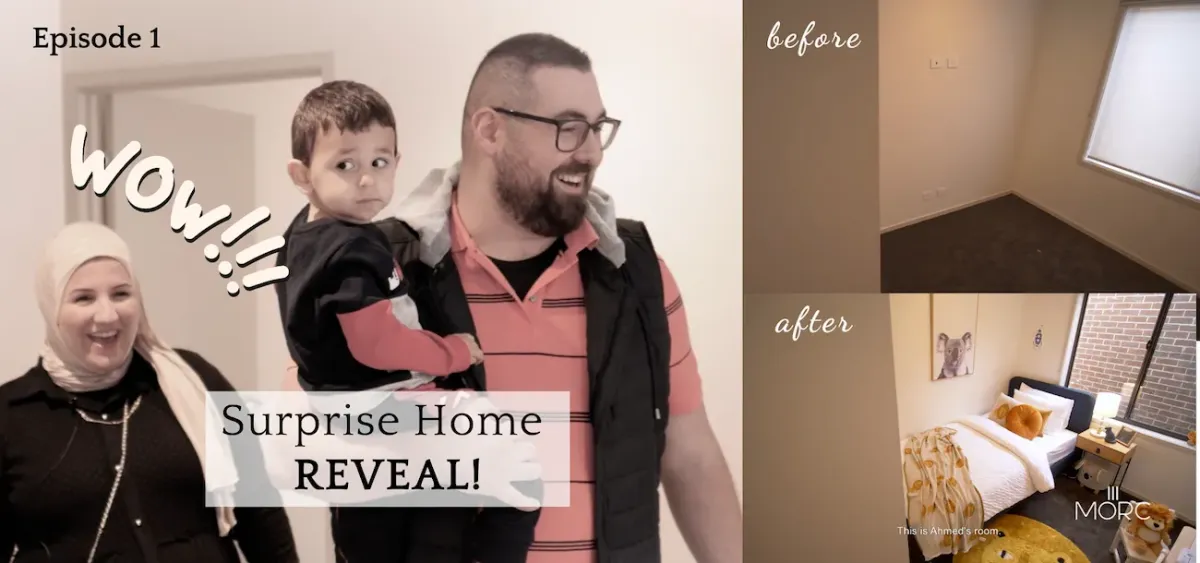
Homeowner Episode 1: Surprise Home Reveal for Farah
“Wow, look!
I left you with an empty house and I came back to a home!”
We recently surprised our beautiful client, Farah and her family, with a complete home makeover. During the peak of COVID 19, Farah approached us to help her furnish her property which was under construction. After many months of planning and designing, we finally decided on a design & style that she was happy with. Keep reading on to find out how we planned, furnished and styled her new home!
Planning
Since Farah and her family are homeowners, we both agreed to take our time and work on the design slowly rather than rushing everything. This gave Farah and her family some space to process our design, think about what style and colour palette she wanted and gave her enough time to make changes.
Our first step was to do a site measure and inspection to familiarise ourselves with the spacial layout. During this time, we discussed Farah’s ambitions for her new home.
“We want to go with a more neutral tone for the living room, and choose furniture & appliances that are long-lasting, sturdy, and last for a long time.”
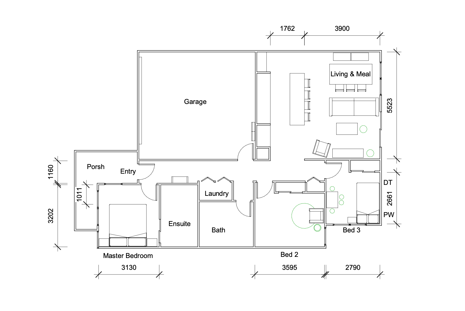
We requested a floor plan, so that we could specify the perfect furniture to fit their home. All furniture selections are drawn up onto a scaled floor plan before we purchase anything. This gives us and our client confidence that the furniture will fit.
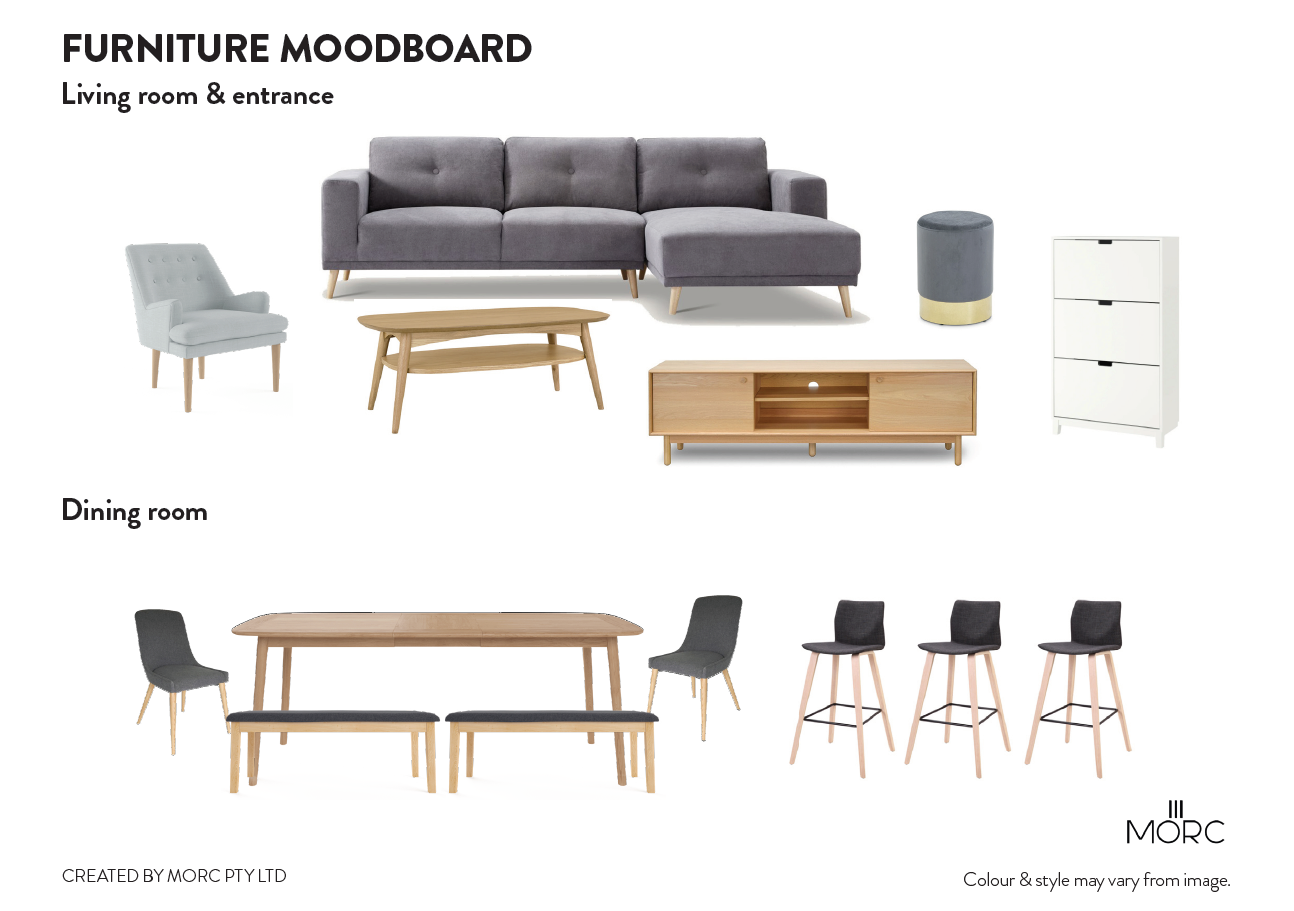
Once the floorplan is complete, we start working on a mood board to showcase everything together. There are multiple reasons why we do this. The furniture moodboard helps us and Farah visualise how each piece of furniture will look when put together. The furniture moodboard helps us save time and hassle from any potential mistakes that could be made when purchasing the furniture!
Furnishing & Styling
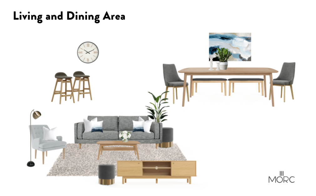
Once we got Farah’s approval on the furniture, we could start styling everything up onto a final moodboard. The final mood board showed the colour scheme and design style that Farah chose for her home. With the plan ready to go, we could start procuring her package and organise a delivery date. Whilst we took the time to plan, design, and organise all the items needed for Farah’s home, the installation process only took 3 days! After that, Farah and her family could move in whenever they wanted.
Let’s jump into the styling process!
Living & Dining
As requested by Farah, we kept the living and dining area neutral and easy to rest your eyes upon. For the living area, we added an armchair and 2 ottomans so that guests had somewhere to sit when visiting.
The colour palette was mostly cool-tone grey’s complemented by light-tone wood, and accents of greenery from both faux and real plants. We decided to use a bench seat rather than just dining chairs to open up the space and provide visual interest. The use of an extendable dining table, meant that they could host lunch or dinner parties without compromising on space.
Master Bedroom
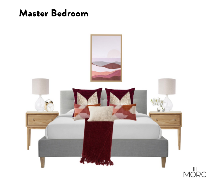
To contrast the neutral-toned living and dining area, we decided to go with a more moody and luxurious colour palette in the master bedroom. Burgundy, cream and gold tones were considered for this cosy bedroom. Plenty of feather filled cushions completed the bed, providing an element of softness to the space. The entire bedroom revolved around the artwork sitting over the bed.
The Nursery
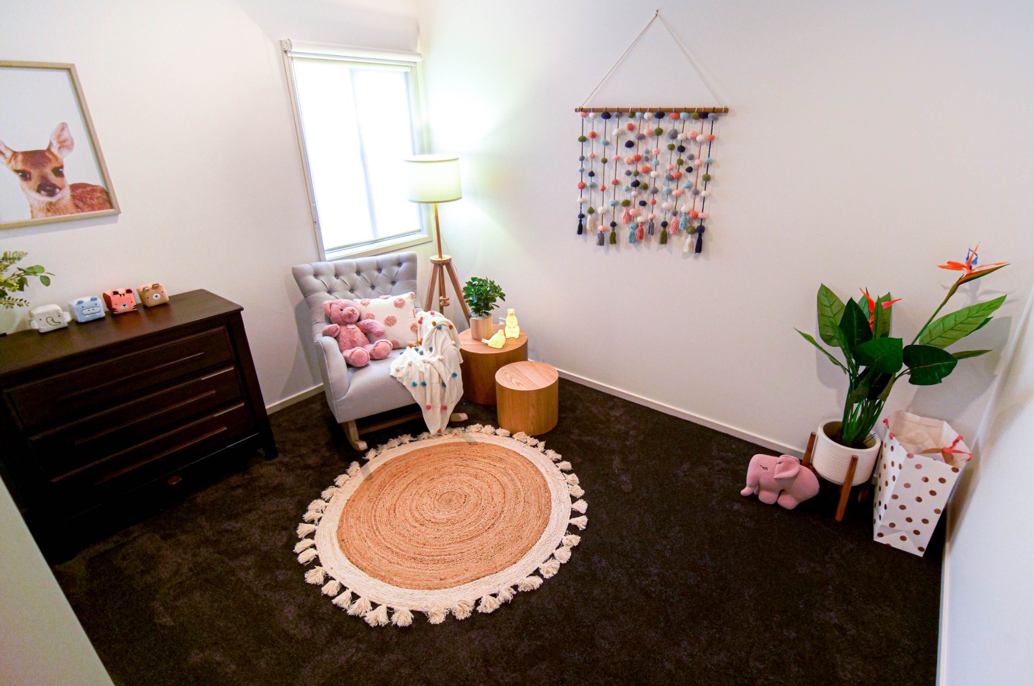
Farah was expecting twin girls but didn’t want to do an overly girly bedroom for them. She had already purchased a beautiful walnut crib (not shown in the picture above) so we worked around that piece. A rocking chair was on her wish list, and a rocking chair she got! A rug was placed with the chair to zone that area and make it feel like a separate space to the crib. The room didn’t get much natural light and the carpet was dark. The contrast of the light rug provided the lift the room needed. We knew that Farah was planning to hang some family photos in the nursery so we kept one wall clear for the picture collage. Choosing the pom-pom piece of art for the wall, accessorised the room and provided some colour.
Kid’s Room
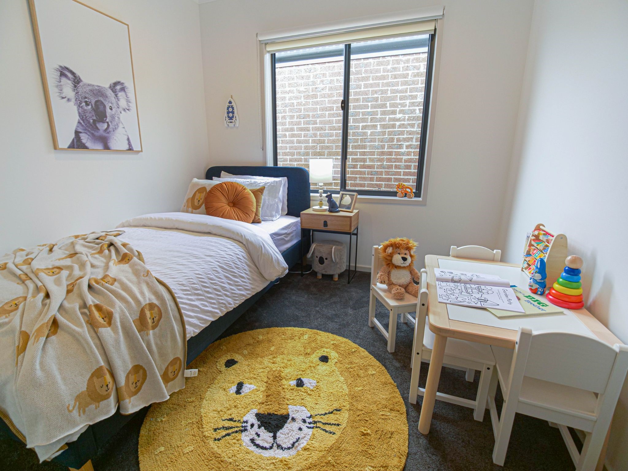
For the kid’s room, we wanted to go for a fun animal-themed bedroom! As you can see from the photo, there is a big focus on the friendly lion on the rug, teddy, throw and cushion. Since Farah’s son was about to become a brother, we thought he might feel a little left out with all the attention going to his twin sisters. We knew that a few happy faces added to his bedroom would cheer him up and make him feel less lonely! Furthermore, the pop of bright colours from the decor provided plenty of visual stimulation. This will keep the concentration internal to counteract the lack of scenic view.
Results
Check out the transformation here:
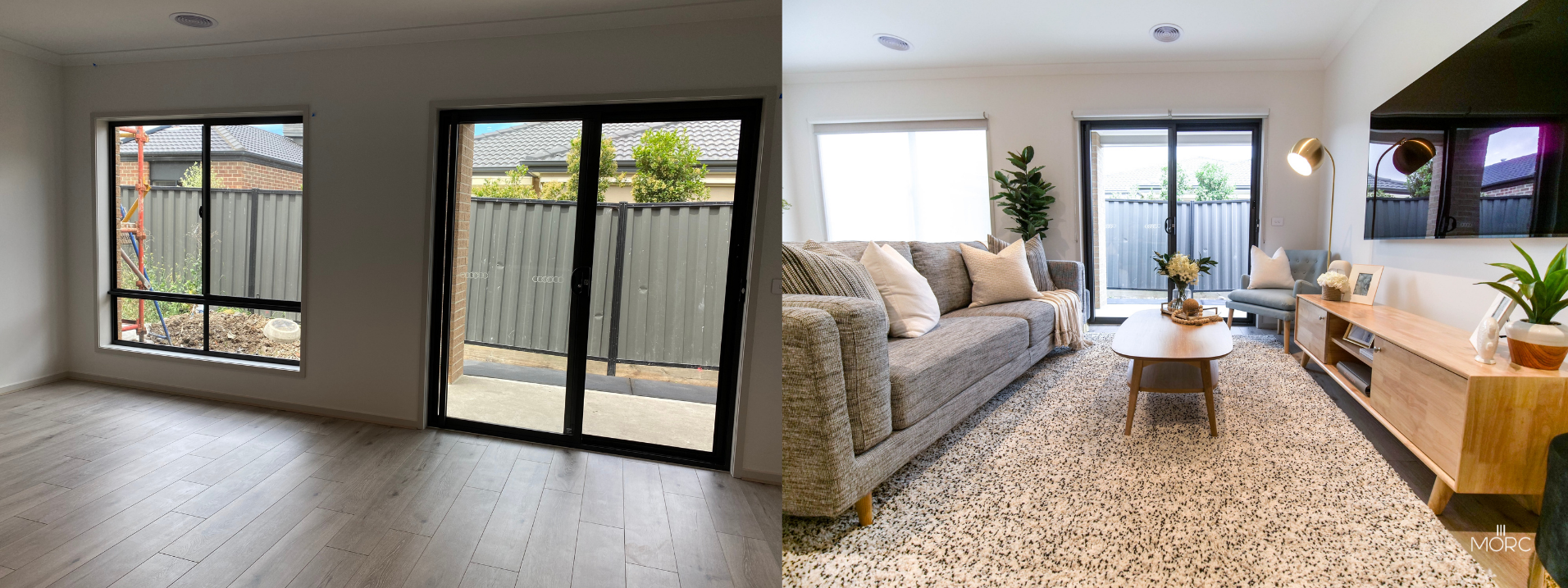
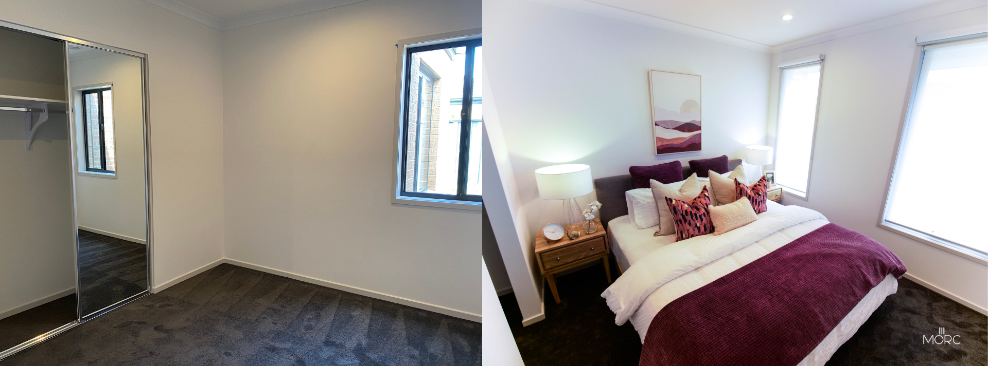
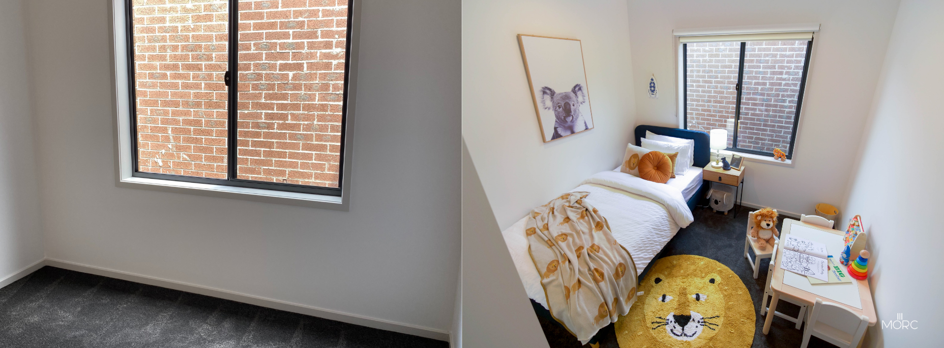
To watch Farah and her family’s reaction on her home makeover, watch the video here:
More Than Just Clients
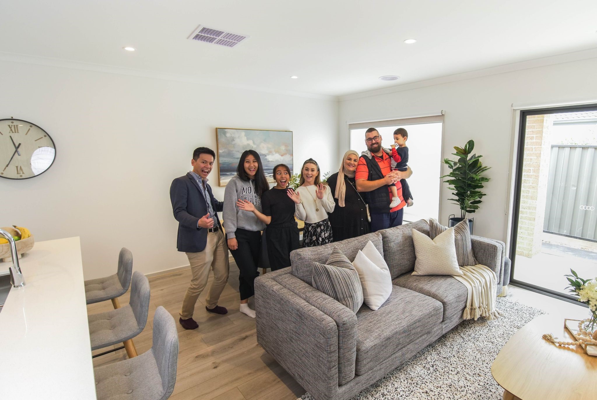
“I can’t pick something that’s wrong with it. I absolutely love it.
Thank you so much.”
We are beyond grateful for Farah and her family for trusting us with something that means so much to them! We understand that for homeowners, our services are not just a simple solution – our design is something that you live with for a long time. Because of that, we are more than happy to invest all our time and effort into helping you create a beautiful home that truly reflects you, and how it makes you feel.
Thank you to Farah and her family for letting us share and celebrate a part of your life journey!
Need Help With Furnishing and Styling Your Forever Home?
If you are a time-poor working professional like Farah that needs their new home taken care of, we would love to help you out!
Contact Us Here
Recent Posts
- 10 High-Impact Lessons that will Increase Rental Yield and Reduce Vacancy in CBD Properties
- Coastal Living Made Simple: Inside a Mt Martha Home Styled With Intention
- Bought at 380 Melbourne? Here’s How This Buyer Got a Fully Furnished, Move-in Ready Apartment in Just 7 Days
- Starting Afresh: Furnishing a Newly Renovated Home
- 5 Essential Tips for Home Office Comfort and Productivity
